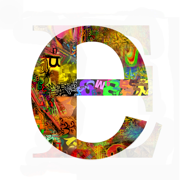
by al2sami on deviantArt. E from series A-Z. It's vibrant, eyecatching and colourful and the capital E in the background adds an interesting element - a good alternative to having just a plain white background.
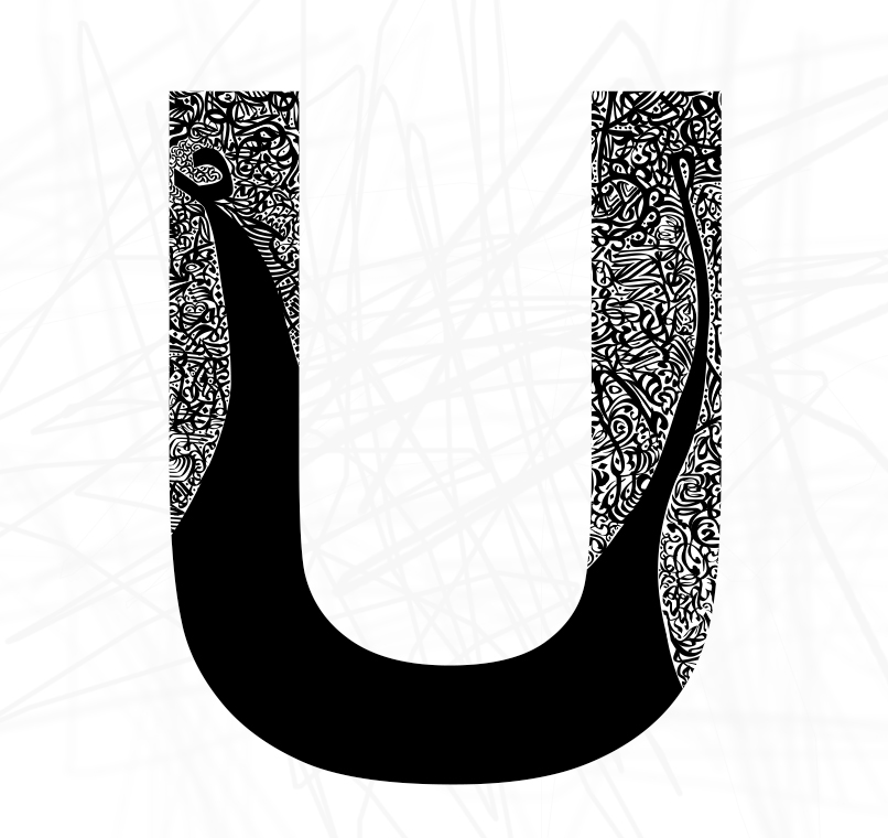
by al2sami on deviantArt. U from series A-Z. The black and white is simple, along with the character, and the patterns are intricate.

by fuzzyzebra on deviantArt. This is just amazing. This may be strange but it has a really scientific feel about it. It's not just flat, it looks like you could reach out and touch it. Typography taken to a whole other level.

by vladstudio on deviantArt. The font used in this isn't particularly good, but I thought the idea was really awesome! I liked how they shaped the type and there's contrast between large and small sizes throughout the image.
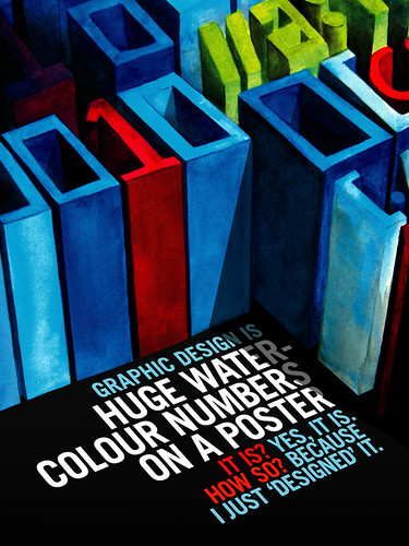
by gravitymachine on flikr. The characters used in this poster aren't just ordinary characters because of the way the designer has made them look more like a painting by using texture and the lines of the characters aren't perfectly straight - they're more fun. The type at the bottom is placed well and the choice of type isn't fancy so it doesn't take away from the watercolour characters. The use of different colours also works because the red and the blue match with the red and the blue on the watercolour characters.

by palax on deviantArt. I really like this piece for several reasons. It uses Helvetica, which is one of my favourite typefaces because of it's simplicity and sophistication. The combination of red, blue and beige/sepia/brown works well together with the black and white and I also really like the grunge texture used. The diagonal layout is also interesting.
0 comments:
Post a Comment