ARAKI NOBUYOSHI
This photograph has a peaceful, serene feel to it and the fact that the subject (Araki's wife) isn't in the centre of the photograph, she is still the focus. I prefer photographs where the subject isn't in the middle because it gives the image a more natural, spontaneous feel.

MARTIN PARR
This photograph his colourful and the eye is instantly drawn to the fluorescent colours and patterns on the hat. I like this photo because at first it is misleading - the hat would suggest that a younger child is the subject, but then you see the floral dress and the characteristc wrinkled hands which tells you the subject is, in fact, an elderly person.

ROBERT ADAMS
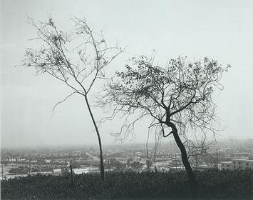
I instantly was drawn to this photo because of the dark silhouettes of the trees against the light sky. I like this because the image goes from highly contrasted at the top (the trees against the sky) and then here's the city below which has greys with less contrast and the fog blends it in. Then you have the grass which is almost completely dark, contrasting with the completely light sky.

JEFF WALL
This photograph has a spontaneous feel to it and the composition is interesting; pleasing to the eye. The paper almost resembles leaves flying from the tree branches, and directs the eye across so you can notice the people, the telegraph poles and cityscape in the background.

GREGORY CREWDSON
The colours in this photograph, especially the houses, are what I lik best about this photograph. It really does look like a still frame from a scene of a movie! The way the light reflects off the wet road creates the effect of the calmness after the rain has passed. This photograph is my favourite out of all the ones I have collected.

CINDY SHERMAN
The facial expression of the woman in this photo is the first thing you notice - you can imagine what she's just read in the letter she has in her hands. Again, the subject isn't in the centre, but the photograph is balanced because of the dark brick wall and the back of a chair on the other side.

TONY VACCARO
The lighting and contrast in this photograph is amazing. The stripes of light gives you the feeling of a prison or being behind bars, being trapped, and the expression on the subject's face enhances that feeling. The light hasnt fallen on the large bags under his eyes, making them dark, which makes the subject look tired and gloomy, yet the lighting makes you have a weary feeling about him.

RICHARD BILLINGHAM
This photograph has a dull, depressing feeling which is enhanced by the lack of bright light and colourful settings. Even though the wallpaper in the background is patterned wih orange and yellow, it is still dull. You can't see the subject's (Billingham's father) face, he's turned away, giving the sense that he doesn't want to be seen, that he doesn't have the heart to look or to face the world, which is enhanced by his slouched posture. The fact that he's (the father) an alcoholic is made clear in this shot as there's a bottle close to his hand in the shot.

LARRY CLARK - JACK AND LYNN JOHNSON, OKLAHOMA CITY (from "Teenage Lust")
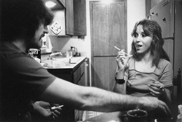
I like this photo by Clark because of it's realistic nature - it doesn't look staged. Even without nudity and suggestive positioning it is provocative (Lynn's facial expression with the needle in her hand creates this feel).
0 comments:
Post a Comment