Dentistry Logos
This logo works because it is simple in colour, choice of font, image and layout. The picture of the tooth is straight forward, and somewhat stylised which works perfectly as it isn't misleading in any way, and it is a comfortable image to look at.
I think this logo works because, akin to the Balmain Dental Clinic logo, the colours, choice of font and picture are easy to look at and there isn't that feeling of intimidation when one has to go to the dentist.
I like the approach with this logo. The colours work together, and the design emphasizes that the dental practice is definitely for the family as "family" is pink instead of grey, matching with the picture of the family at the top - it's convincing. The colour scheme is soft, which makes it more calming instead of giving it a sterile feel.
Florist Logos
This logo works because it's simple in colour, picture and font but the faded mirror image gives it another dimension - it's funky, looks designer-ish and it isn't in your face.

I think this logo is elegant - it makes one think that the florists would be an elegant place to go to purchase flowers - and the choice of having three different fonts works effectively. The colours are neutral and they give the logo a tranquil feeling.
 This logo also works because of it's simplistic elegance. The font is easy to read and contrasts with the darker image on the side. The use of the white line for the stem in the picture ensures that the green flowers aren't lost against the blue and next to the lighter green opposite.
Gym Logos

I think this logo is elegant - it makes one think that the florists would be an elegant place to go to purchase flowers - and the choice of having three different fonts works effectively. The colours are neutral and they give the logo a tranquil feeling.
This logo also works because of it's simplistic elegance. The font is easy to read and contrasts with the darker image on the side. The use of the white line for the stem in the picture ensures that the green flowers aren't lost against the blue and next to the lighter green opposite.Gym Logos

This logo is big and bold and it works because it isn't swirly or soft in any way, shape or form, so it's likely to attract people who want a good work-out (it gets its message across). The black shapes form FBI - Future Bodies Institute, but it's a little difficult to recognise that straight away, and even though the word Gymnasium is in a small font, it stands out because it's light grey against a black background.
 The use of the infamous evolution image is what makes this logo work. The message the logo gives is that if you go this gym, you are elite - you're the next step forward from the every day human being. The simple black and white scheme is effective as there's no colour to distract you from the image or the name. The attraction is all in the image.
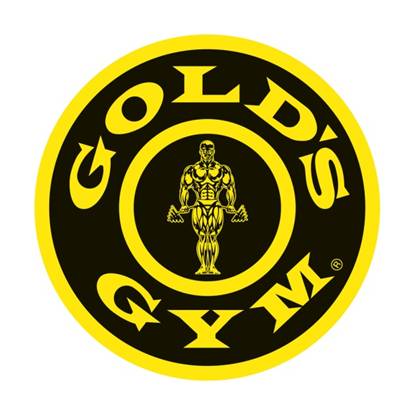
This logo, just like the FBI logo, works because of it's bold design. The yellow strands out against the black, the font is bold, block-like and easy to read and it's different to the others gym logos as it's in a circle instead of a square or rectangle. The stereotypical iron/muscle-man in the centre would attract people to the gym as their goal is to get fit and to achieve a better looking body and the logo illustrates that it can happen.
The use of the infamous evolution image is what makes this logo work. The message the logo gives is that if you go this gym, you are elite - you're the next step forward from the every day human being. The simple black and white scheme is effective as there's no colour to distract you from the image or the name. The attraction is all in the image.This logo, just like the FBI logo, works because of it's bold design. The yellow strands out against the black, the font is bold, block-like and easy to read and it's different to the others gym logos as it's in a circle instead of a square or rectangle. The stereotypical iron/muscle-man in the centre would attract people to the gym as their goal is to get fit and to achieve a better looking body and the logo illustrates that it can happen.
0 comments:
Post a Comment