
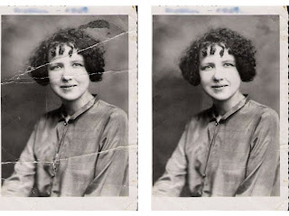
this afternoon we did an exercise using the clone tool in photoshop where we had to get rid of the cracks in an old photograph. here's the before and after:


in class we had to come up with a few 1cmx1cm designs and then we had to choose one and create an A3 page pattern, repeating and varying the design. here is my attempt - i'm really happy with how it turned out :D
another attempt:


Wednesday, July 14, 2010

We were shown a picture where on one side in one corner there was a collection of little drawings all bunched together and after you looked at it for a while, you noticed individual shapes. There were clouds in the opposite corner, and a popular sun burst in the background, drawing the eye from the corner drawings out across the page. It had an earthy colour scheme with (from what I can remember) red, orange, brown and purple, tying all the elements in the image together. I had an attempt using my paint splatters in the corner with other little drawings - i used the three colours yellow blue and green from the paint splatters and used different shades of them.
using the paintings we made using a pencil, we had to design a cd cover with an original title.
'colourful language' is the title of my cd and i tried a geometric design using square sections of my painting. it isn't a particularly original style but i wanted the painted sections to stand out and i also wanted to see how i could place the type creatively.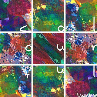
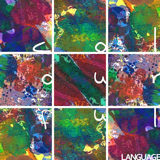
'colourful language' is the title of my cd and i tried a geometric design using square sections of my painting. it isn't a particularly original style but i wanted the painted sections to stand out and i also wanted to see how i could place the type creatively.


Fergus the Friendly Fellow
Fergus was a friendly fellow with bright orange fur and a big smile on his face.
He lived in the middle of a jungle in a far away land where there were lots of trees, flowers, frogs and birds.
But Fergus was lonely in the far away jungle.
The frogs and the birds were all scared of his big feet and wild fur, so they would run away from him.
Fergus really wanted somebody that was friendly just like him.
He wanted somebody who had a big smile on their face just like him and somebody who wouldn’t run away from him.
One day Fergus decided to go on an adventure to find a friend.
Down by the pond there was not one, but two monsters, and they both had big smiles on their faces and looked friendly just like Fergus.
Their names were Tolbert and Gog.
When Fergus asked them if they would like to be his friends, they both jumped for joy and said "Yes, we would!"
Fergus was feeling much better but he decided that the adventure wasn't over just yet, so the three friendly fellows with brightly coloured fur and big smiles on their faces decided that they would go and find some more friends.
Leaping and bounding through some long grass was not one, but two monsters, and they both had big smiles on their faces and looked friendly just like Fergus, Tolbert and Gog.
Their names were Izzel and Bamber.
When Fergus asked them if they would like to be friends with he and the others, they both danced in delight and said "Yes, we would!"
Fergus was feeling much better and decided that five was a fun number, so the five friendly fellows with brightly coloured fur and big smiles on their faces decided to play all day until the sun went down and it was time to go to bed.
Fergus still lived in the middle of a jungle in a far away land with lots of trees, flowers, frogs and birds but he wasn't lonely anymore because he'd found friends that weren't scared of his big feet and wild fur and didn't run away.


Fergus was a friendly fellow with bright orange fur and a big smile on his face.
He lived in the middle of a jungle in a far away land where there were lots of trees, flowers, frogs and birds.
But Fergus was lonely in the far away jungle.
The frogs and the birds were all scared of his big feet and wild fur, so they would run away from him.
Fergus really wanted somebody that was friendly just like him.
He wanted somebody who had a big smile on their face just like him and somebody who wouldn’t run away from him.
One day Fergus decided to go on an adventure to find a friend.
Down by the pond there was not one, but two monsters, and they both had big smiles on their faces and looked friendly just like Fergus.
Their names were Tolbert and Gog.
When Fergus asked them if they would like to be his friends, they both jumped for joy and said "Yes, we would!"
Fergus was feeling much better but he decided that the adventure wasn't over just yet, so the three friendly fellows with brightly coloured fur and big smiles on their faces decided that they would go and find some more friends.
Leaping and bounding through some long grass was not one, but two monsters, and they both had big smiles on their faces and looked friendly just like Fergus, Tolbert and Gog.
Their names were Izzel and Bamber.
When Fergus asked them if they would like to be friends with he and the others, they both danced in delight and said "Yes, we would!"
Fergus was feeling much better and decided that five was a fun number, so the five friendly fellows with brightly coloured fur and big smiles on their faces decided to play all day until the sun went down and it was time to go to bed.
Fergus still lived in the middle of a jungle in a far away land with lots of trees, flowers, frogs and birds but he wasn't lonely anymore because he'd found friends that weren't scared of his big feet and wild fur and didn't run away.


http://gallery.thenationalgrid.com.au/
some of the works from the current exhibiton - i thought they were really awesome :D

some of the works from the current exhibiton - i thought they were really awesome :D


This is one of my favourite typographic pieces on the net so I really wanted to see if I could recreate it (and do it justice):
I've done three versions; the first two are very similar, only the larger letters have been duplicated and the opacity has been lowered to make a drop shadow. The third is just a monochrome. I had a few issues because I didn't actually have Helvetica so I used Arial instead.


I've done three versions; the first two are very similar, only the larger letters have been duplicated and the opacity has been lowered to make a drop shadow. The third is just a monochrome. I had a few issues because I didn't actually have Helvetica so I used Arial instead.


We were given the task to design a logo for a business. We drew these businesses from a hat, and with the business name we were given a pantone colour to go with it. My business was Bill Smith's Plumbing, PANTONE 3005, a really nice blue. I researched a lot of plumbing business websites and most of the logos had water drops or taps. One bizarre one had a jumble pipes and faucets so I wanted to go with something really simple but identifiable. This is what I came up with:

PANTONE 3005 C
C=100, M=34, Y=0, K=2
R=0, G=129, B=198
WHITE
C=0, M=0, Y=0, K=0
R=255, G=255, B=255
We then had to make a skin for a website using the two PANTONE colours plus another three to have a collection of five hues. We were also allowed to use unlimited shades and tints of these colours. I just used the white, plus shades and tints of PANTONE 3005 because on most of the plumbing websites I found there wasn't a huge range of hues used.
Here's what I came up with:


PANTONE 3005 C
C=100, M=34, Y=0, K=2
R=0, G=129, B=198
WHITE
C=0, M=0, Y=0, K=0
R=255, G=255, B=255
We then had to make a skin for a website using the two PANTONE colours plus another three to have a collection of five hues. We were also allowed to use unlimited shades and tints of these colours. I just used the white, plus shades and tints of PANTONE 3005 because on most of the plumbing websites I found there wasn't a huge range of hues used.
Here's what I came up with:


Chaos and Control
I've done the same theme for both chaos and control. One room is ordered and equal whilst the other is not ordered and not equal. The floral mugs are my own.

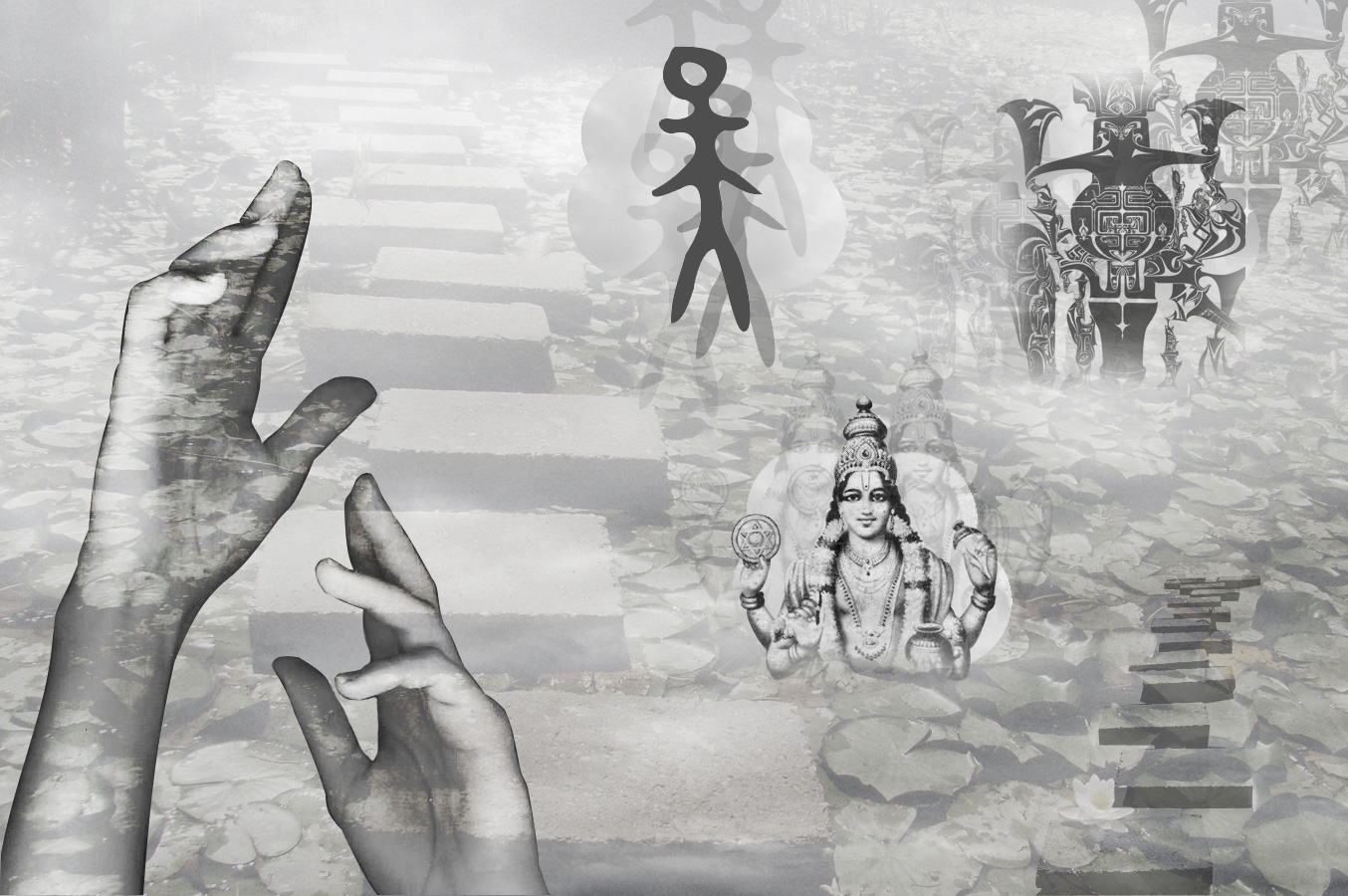
Heaven and Hell
For heaven I researched other culture's beliefs of heaven and made a composit of different symbols including: cloudy sky (my own image), a path which represents the path taken to heaven, Chinese Zhou Dynasty Oracle script for Tian, the character for Heaven or sky, Deva (gods in Hinduism), and hands reaching up to the sky, offering their soul.
For Hell, I chose to do something personal, what would be hell for me. I am terrified of spiders so I thought I would incorporate them into my image, being the dominate theme. If I were to go to hell this is probably what it would be like - being tortured by big black scary spiders. My own image here is the background and the girl (my sister) lying off to the side, being attacked by spiders.


Dissonance and Harmony
For harmony I included calm, happy images, including people holding hands, laughing and smiling. I believe we can all have harmony if we embrace others regardless of what race, religion, gender, etc., they are. For Dissonance I went with something more literal, less personal, with a green island in the middle of a desert where it doesn't belong with the sand and the scorpions. The pattern on the scorpions are actually from a photograph I took of some pomegranates outside in our garden. I chose to do this because the pomegranate symbolises fertility, something you wouldn't associate with a desert. The cracks in the image are just to create some chaos.
I found the Serial Cut website really interesting. I'm not a huge fan of 3D but I liked this website because of the way the designers have used type in their work as both the image and the information - the type isn't separated or isolated from any of the images; it brings the image together and it works. The photography in some of the pieces on the site are very strong as well and it adds a conventional element to the radical treatment of type and other elements. Their work is convincing as both an advertisement and as a work of art and this is why I like it so much.
These are the ones I liked the most:

I like this because of the composition of all the natural elements and the way the type works well with them - the colours are soft, low-key and natural and the typefaces used aren't over the top or too decorative.

This has a very cool, very enticing feel about it and it captures nightlife perfectly with the use of colour (the colours you'd usually associate with nightclubs - neon blues and pinks) and glass effect.

Like the image above, this captures the feeling of a nightclub with the glass effect and also the sensual red colour and curvy, curling shapes.

I love the colour combo of orange and blue together. This is very easy to look at. It's fun, it's simple and it's bold, and the fuzzy texture makes it look friendly - if you threw one of those blocky letters at somebody it probably wouldn't hurt.
These are the ones I liked the most:

I like this because of the composition of all the natural elements and the way the type works well with them - the colours are soft, low-key and natural and the typefaces used aren't over the top or too decorative.

This has a very cool, very enticing feel about it and it captures nightlife perfectly with the use of colour (the colours you'd usually associate with nightclubs - neon blues and pinks) and glass effect.

Like the image above, this captures the feeling of a nightclub with the glass effect and also the sensual red colour and curvy, curling shapes.

I love the colour combo of orange and blue together. This is very easy to look at. It's fun, it's simple and it's bold, and the fuzzy texture makes it look friendly - if you threw one of those blocky letters at somebody it probably wouldn't hurt.
Subscribe to:
Posts (Atom)