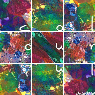
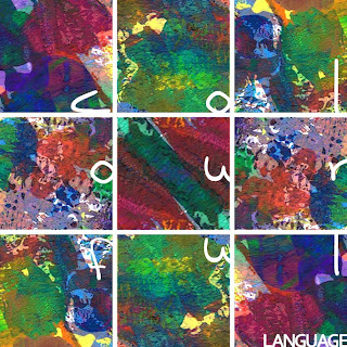
'colourful language' is the title of my cd and i tried a geometric design using square sections of my painting. it isn't a particularly original style but i wanted the painted sections to stand out and i also wanted to see how i could place the type creatively.


0 comments:
Post a Comment