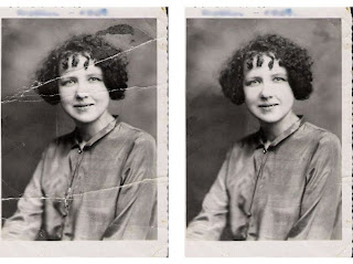
using the clone tool on photoshop
Posted by
Ani1391
at
Tuesday, July 27, 2010
Tuesday, July 27, 2010
this afternoon we did an exercise using the clone tool in photoshop where we had to get rid of the cracks in an old photograph. here's the before and after:


Pattern Design; Theme, Variation & Repitition.
Posted by
Ani1391
at
Wednesday, July 21, 2010
Wednesday, July 21, 2010
Posted by
Ani1391
at
Wednesday, July 14, 2010
Wednesday, July 14, 2010

We were shown a picture where on one side in one corner there was a collection of little drawings all bunched together and after you looked at it for a while, you noticed individual shapes. There were clouds in the opposite corner, and a popular sun burst in the background, drawing the eye from the corner drawings out across the page. It had an earthy colour scheme with (from what I can remember) red, orange, brown and purple, tying all the elements in the image together. I had an attempt using my paint splatters in the corner with other little drawings - i used the three colours yellow blue and green from the paint splatters and used different shades of them.
using the paintings we made using a pencil, we had to design a cd cover with an original title.
'colourful language' is the title of my cd and i tried a geometric design using square sections of my painting. it isn't a particularly original style but i wanted the painted sections to stand out and i also wanted to see how i could place the type creatively.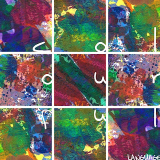
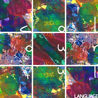
'colourful language' is the title of my cd and i tried a geometric design using square sections of my painting. it isn't a particularly original style but i wanted the painted sections to stand out and i also wanted to see how i could place the type creatively.


Subscribe to:
Comments (Atom)


