Recipe

Wednesday, August 3, 2011

Fact about Bailey’s;
The R.A. Bailey signature you see on the Bailey’s bottle is a fictional creation. Both the name and signature were inspired by the Bailey’s Hotel in London.

Bailey’s Butterscotch Bomb Mousse Cake

Ingredients

Biscuit base:
2 cups plain biscuits (e.g. Milk Arrowroot), crushed
2 tbsp cocoa powder
125g butter, melted

Mousse:
6 egg whites
600ml thickened cream
3 tsp gelatine
¼ cup boiling water
100g milk chocolate
100g dark chocolate
120ml Bailey’s Irish Cream
60ml Butterscotch Schnapps/liqueur

Method

1. Line base of a spring form tin with baking paper, grease the sides. Combine the crushed biscuits and cocoa powder in a small bowl, then add the butter and stir until well combined. Place the mixture into the bottom of the tin and spread evenly, patting down firmly. Chill in refrigerator for 30 minutes.

2. In a heat proof bowl add the chocolate and melt over a pot of boiling water. Take the bowl off the heat and slowly add the Bailey’s and liqueur once chocolate has melted, stirring gently so the mixture doesn’t curdle. Set aside to cool.

3. Combine gelatine and water, stir until gelatine is dissolved. Set aside to cool.

4. Whip cream in a large bowl and fold in chocolate mixture and gelatine. Whip egg whites until soft peaks form and fold into chocolate and cream mixture in 2 batches. Take biscuit base out of refrigerator and pour mousse into the tin. Place back into refrigerator to chill overnight.

Portfolio Content & Website Revision

Wednesday, July 20, 2011
Digital Designer at Link Digital, Canberra
http://www.seek.com.au/Job/digital-designer/in/act-act/20163950

What are the mandatory portfolio requirements for the job?
There were no particular portfolio requirements listed in the ad, but from reading the duties, I imagine your portfolio would have to be very high quality, showcasing a range of different works.

What experience/skills does the job require?
-Must have a degree
-A passion for creating beautiful designs and for continual learning
-Experience providing design solutions
-Developed communication skills
-Proficiency especially in Photoshop, Illustrator and InDesign
-Flash/Multimedia skills considered an advantage

What portfolio pieces do you have that would be appropriate for the position?
I have quite a good number of good poster designs that I think would be appropriate and that would potentially impress the employer.

Would a digital or print portfolio be best suited for the position? both?
I think that both would be suited as they're also looking for multimedia skills as well.


Junior Graphic Designer/Digital Operator at Worldwide Online Printing, Sydney
http://www.seek.com.au/Job/junior-graphic-designer-digital-operator/in/sydney-southern-suburbs-sutherland-shire/20232092

What are the mandatory portfolio requirements for the job?
As above.

What experience/skills does the job require?
-High level proficiency in InDesign and Adobe creative suite
-Innovative and creative
-Strong communication skills
-Good commercial discipline
-Work in fast paced environments
-Customer liaison required
-Sales and marketing focus would be an advantage

What portfolio pieces do you have that would be appropriate for the position?
As above; especially as most of them have been created in InDesign and the employer is looking for proficient InDesign skills.

Would a digital or print portfolio be best suited for the position? both?
More than likely a print portfolio, but it couldn't hurt showing them a digital portfolio as well.


Graphic Designer at NGV, Melbourne
http://www.seek.com.au/Job/graphic-designer/in/melbourne-cbd-inner-suburbs/20211066

What are the mandatory portfolio requirements for the job?
As above.

What experience/skills does the job require?
-Degree or diploma in Graphic Design
-Working with Style Guides
-Experience in working in a dynamic, fast-paced commercial/advertising studio environment.

What portfolio pieces do you have that would be appropriate for the position?
Poster designs, logo designs and I also could add in a style guide we had to create for an assessment to show that I do know how they work.

Would a digital or print portfolio be best suited for the position? both?
Both; they're looking for a Graphic Designer and you could be subject to a lot of different jobs so giving them an option to see a digital portfolio would be suitable.

Design Solutions

Friday, June 24, 2011
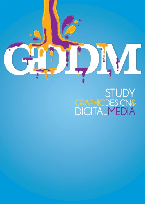
Here are the final products for the ITC and Graphic Design Interactive Digital Media posters:

What I really wanted to achieve with this bottle poster was to get the message across in a different way to the designs we were shown to begin with. I wanted it to look fun and arty instead of corporate and cold, and that’s why I came up with the sketch, having little water droplets climbing out of the bottle in protest. I also had a more serious idea with a water bottle with all the names of the chemicals that go into the plastic seeping out into the water with the slogan ‘convenience comes with a price’. I showed these sketches to a few people and they said that both the ideas were good, so I made a start. Unfortunately I left things a little too late and I left the water droplets idea and went with the more serious concept.

Once I started, I received feedback that having the chemicals seeping out into the water was more complex that it had to be – the most important thing was that the message was clear. This didn’t matter though because I had created a background that I could keep, I just needed to change the message. I went with a solid sky blue background with a solid white outline of a plastic bottle because it was simple and wouldn’t take away from the eventual message.

My new concept was to have my slogan ‘convenience comes with a price’ left aligned in a sludgy, sick looking typeface. I also came up with having ‘say no to buying plastic bottles’ underneath the slogan to make the message clearer. I had a lot of issues with the type because the font I originally chose and was set on using (Blood Crow) looked wrong. I went through so many typefaces that I thought personified poison and chemicals, but nothing was working, so I decided that I would have to move away from those particular fonts and try something more simple to go with the simplicity of my imagery. I finally found something I was happy with – a bold sans serif font, Lazy Sans, which blended in perfectly with the image of the bottle. My next challenge was picking the colours. I originally had grey and white, but then I decided I needed some black to make the message stand out. I had ‘convenience comes with a price’ in black and ‘say no to buying plastic bottles’ in white but it didn’t look quite right, so I reversed them and asked for some feedback on which looked better. I was told they both looked good and it all came down to which message I thought was the most important to communicate. I ended up choosing the reverse (having the convenience message in white at the top and the say no message in black underneath it) and was really happy with it. I then decided I wanted to have some more information on there, such as a reason why convenience came with a price and why people should say no to buying plastic bottles, so I added a fact down the bottom in small white type ‘producing 1 litre of bottled water can emit 100 times more greenhouse gases than 1 litre of tap water’. I chose this fact because I thought it was the most relevant to the current issues surrounding greenhouse gases and carbon emissions. I was happy with this choice as it completed my poster.

I received very positive feedback for the final product – I got the message across effectively whilst having an aesthetically pleasing poster and I am very happy with the final result. I liked that I had to make so many changes to this because I got to learn more and work harder to get the best results possible.

Water Bottle Project Roughs;
Unfortunately I was unable to find my digital roughs for this project, but here are the sketches;


I thought the best research I could do was to see what posters representing Graphic Design I could find. Here are a few I found;

http://behance.vo.llnwd.net/profiles/51435/projects/83184/514351207158271.jpg
http://www.flickr.com/photos/veerles-blog/2246394596/
https://blogger.googleusercontent.com/img/b/R29vZ2xl/AVvXsEg6t_Vox7O9MRDQVe5v22ZgfhdaO4WY4pkU9hG7B5I0dkEcXHKMLBRZjaXtUrNvwzIVVlAM1hKf-kQb0Ga_N8scm4qQQupsAcVVpFbq_fGwmWc_VBgS_errmn31sbkriEqzl7vRufKr1gmh/s1600/graphic_design_a1_poster.jpg

http://www.positive-magazine.com/wp-content/uploads/2010/05/Scaled-Image-2.jpg Networking and ITC posters were very scarce, so I decided to look at some websites and some futuristic/tech looking tutorials to get some inspiration;


http://dell.com.au/
http://www.acer.com.au/ac/en/AU/content/home
http://windows.microsoft.com/en-AU/windows-vista/products/home

Challenge – to come up with poster designs promoting Graphic Design and Interactive Digital Media and Information and Communication Technology courses at TAFE.
Client – George Holt, head of the ICT Department.
The initial meeting with our client certainly got us thinking. We came up with a list of things we wished to discuss with the client:
Printers – when we would have to book the printers and which printing company would we be approaching
We were giving ourselves a 3 week deadline because of the printing
What size would we be making the posters
What information we were to put on the posters
How many would we get printed
Budget
We would come up with 6 designs – 2 each; one for graphic design and one for ICT (this was when Michelle was still with us)
We would provide thumbnail sketches after our initial meeting
Legal requirements
Tafe logos
Talking with marketing
Whether or not the posters would be ongoing.
When we sat down for our meeting, our client told us everything he wanted – which ended up being more than we’d expected. They wanted more than just posters; they wanted banners as well. We were a little bit thrown by that but we said that we would do the best we could in the amount of time we’d been given to complete the project. It was a successful initial meeting and I feel we were all very professional about it – we discussed everything we needed to, organised our next meeting and told the client what we were capable of doing in the short amount of time we were given.