JAM

Tuesday, March 23, 2010
On Tuesday, 24 March we were given the task to come up with a logo for a business. We were put into groups - I was with Jules and Mitch - and we had to come up with a name for our design company. The very original (maybe not so original - still good, though) idea to use the first letters of our names to make the company name was decided upon, so therefore we became JAM Graphics.

The groups were asked to meet with a client in order to determine the details: their business, what image they were going for, etc., and it was actually quite a good role-play exercise. Our client was William "Bill" Preston. His company was a family owned earthmoving business by the name of Preston's Earth Moving. His business was located at Bomen, Wagga Wagga, and had been operating for three years. Bill told us that he wished to have a new logo that stood out from the original - something that made the business identifiable, something that gave the business an image. When asked about colour scheme, he said that perhaps black and white would be a good way to go - he wished to have the logo on the machinery (trucks, bobcats, tractors, etc), which is orange in colour, and on the uniforms. Immediately I thought along the lines of tough. A block-y, bold typeface would be preferable for the job. When we asked about what he'd like on the logo, whether he'd like a picture of anything, he specified that he wanted both a logo with and without a picture. Bill also mentioned that he had a tight budget - "tough economic times".

When all of the groups had their mock-meetings, we were told that we had until midday to finish out first designs. When Jules, Mitch and I left to start on our job, we all shared our ideas that were all rather similar - a tough, blocky image with grunt. We agreed that we needed to research other logos of similar businesses, so we googled some images of earth moving equipment, industrial machinery businesses and brands such as Caterpillar. There were lots of images that we used to create our first ideas. The layout of the Mick Humphrey’s training group logo inspired Mitch's and my logo - an image in the centre with curved words framed the top and bottom of the image. We changed it around a little and had Preston's in the centre with earth at the top and moving down the bottom. I worked on just the text logo, whilst Jules and Mitch worked on the pictorial logo. Together we also came up with what typefaces to use: Impact and Stencil, as they were the blockiest and most with-grunt typefaces we had available to us at the time.

This is what I initially came up with:

Mitch's layout was similar to mine as it had Preston's in the centre and earth at the top and moving at the bottom, but instead of just being type he had the idea of having a tractor tire as his image and he put Preston's in the middle. We several images of tractors and bobcats and there was one logo – the Northern Beaches earth moving - that inspired one of Jule's designs. Jules also used a cartoonish picture of a tractor for another one of her designs, having the type in front, looking as though it was being moved away. We made two versions of our logos, one with Impact as the type and one with Stencil as the type to see which the client liked best.

Then came feedback time.

Bill told us that he wasn't a fan of the Stencil typeface and that Impact was better. He said that mine looked like a number plate - and to be honest, it did, but he still liked it. Mitch had to tell Bill that his tire was actually a tire, because the client thought that it was a saw, which we didn't even consider because we knew that Mitch had traced a tractor tire with the pen tool on Illustrator, but once Bill pointed it out we saw what he meant. Out of Jule's images he preferred the tractor with the type being pushed away but he asked that the type be moved at the bottom of the image instead and that the shape of the tractor be a little simpler. He asked me to make different variations of my logo, and here's what I came up with when we went back to work on the revisions:


I also tried switching the colour-scheme as well.


I decided that having the text just flat on top and bottom was a lot more appealing than the curved shape, and then I decided to put it all inside the one box, but still making sure that the name Preston's stood out. After looking at all of the revisions, the text inside the box worked a lot better than having it outside. I put some bolts in the corners of some just to play with the idea of having it look like a number plate, but Jules said it reminded her of something else and we decided that without the bolts looked better.

I was annoyed that we hadn't a huge range of typefaces to work with, but for that particular job, I thought Impact worked and it made the logo seem blocky and tough and I thought that I had it in control.

I thought as a group we worked well. We all shared our ideas and we helped one another and gave comments and feedback on our finished logos (I think Jules and Mitch were a bit too kind to me and I think I talked too much and had too many ideas haha). But I think after the feedback session, we worked really well and we all had an idea of what to do, and the finished products looked really good. Together as a group we were successful in solving the client's problems. We were given enough information and between us we had good ideas to work with so together we were a pretty good problem-solving team.

I thought using Illustrator for these logos was really good - my idea was relatively put together in Illustrator, though there were some difficulties I had when trying to figure out how to kern and how to make the text curve, but that was sorted out just by asking. I don't think the technology really held me back on this idea.

I think when our designs were revised, they evolved and they became a lot tighter. When I chose to use plain text instead of curving it, it became a lot tighter but then when I put all the text inside the box it was tighter still. Looking at the original, it fits into a box or rectangle, but it doesn't seem as clean or as compact as the revisions, and I'm glad that my design could evolve like that.

Coming up with an amount to charge a client for a job like this is difficult to think about. On one hand, you have to consider their budget, and on the other, you have to charge what you think is adequate for the service you are providing and your skills. I think because we had a day to create a logo (roughly six hours) think I would charge something like $40-$45 an hour. For a real job I would choose to have the hourly rate of $60+ or so.

I think this exercise was very enjoyable, and I had a great time doing it. As well as designing posters and book covers, this is exactly the type of work I hope to be doing as a graphic designer. I think doing these kinds of exercises in groups helps so the other people in your group can look at it separately, with different eyes as they have not been working on it and it isn't their idea so they are able to give you an idea of what a client might say. Working on my own on something like this would have also been really good, but I enjoy working with both people and on my own.

In a way, Bill Preston was specific without being particular in what he wanted. Just by saying where he intended to have the logos, wanting it to be the image of his company, we were able to determine what sort of logos we should come up with and I think our client was realistic with his expectations - he wanted something bold for his company, he wanted something simple, so I don't think he was asking too much of us.

One day to create a logo seems realistic, but you have to consider revision periods and the job itself. A graphic designer may have other jobs to work on at the same time so a time period of three days to a week would be more realistic. It also depends on when the client needs to have it done by and what they want done with the logo, how complicated the design may be.
Overall, I thought being put into groups was a great idea and it was a great opportunity to work with other people I didn’t usually work with. It was great to see how others planned and how they developed their ideas. It was also great being able to see the other group’s work and it was also interesting to see how they approached their tasks. I had a lot of fun doing this exercise and I would enjoy doing something like this again.

These are the revised logos that I will be presenting to Bill at our next revision:

Raiders Logo

Thursday, March 18, 2010

A bit of Illustrator work - using the pen tool on a larger scale.

----------------------------------------------------------------------------------

Here are some more logos that we had to replicate using Illustrator:


LOGOS

Monday, March 15, 2010


THE NOISE music festival logo + poster

Thursday, March 11, 2010

I thought it would look cool just as is - black and white


The finished poster

Music Festival Posters

Thursday, March 4, 2010
Just a few music festival posters I thought were pretty groovy.


This poster has an appealing folk/indie feel to it with the use of natural, warm colours and motifs such as th vines, the wheat in the background and the wooden-looking signs and picture border in the centre.


I like this poster because the colour scheme is simpleand the shapes used are fun and flowing.


This poster, even though it has a lot going on in it, is really cool. It's bright and exciting and your eye is drawn to different parts of the poster after seeing the bold "VISAYAN MUSIC" at the top. It's the kind of poster that you would stop to look at on the street if you saw it on a billboard or light post.


I like how this poster has a really grunge look about it. The main part of the poster is the band names which draws your eye, and then you notice the patterns, shapes and colours in the background. It works because the rest of the poster is plain and uneventful, therefore not taking the spotlight away from the main event - the bands that will be playing at the fesival.


Like the winter jazz festival poster, this one has fun shapes and a simple colour scheme. You get a fun vibe from the poster.


The main reason I found this poster attractive was because of the huge pirate ship on it :P but the colours are simple and they work together. The varying shapes of the poster unite the entire image and makes it work as a whole. The top half is balanced by the text on either side of the triangle, which draws your eye to the centre of the poster to the island and trees. The bottom half of the poster works because the pirate ship itself is just one solid colour against the repeated circular pattern.

Mean Green Killin' Machines

Tuesday, March 2, 2010
WHAT WORKS? - With the colour scheme being rather low key, there aren't clashes with the images - the greens in each image is able to stand out against the brown of the background without being difficult to look at. The text at the bottom of the page balances everything out, and there was no totally blank space left which looked awkward to begin with.

WHAT DOESN'T WORK? - The space between ther three images and the blocks of text beside them - the gaps are too big and they don't go with the small space between the image and the text beside or the borders (which are also uneven) which are much smaller.

WHAT WERE THE DIFFICULTIES YOU ENCOUNTERED WITH SPLITTING THE RECTANGLE? - Deciding the layout with the page. I took a more pedestrian approach with the layout, and therefore I found that if things weren't in line properly, everything looked out of place - it didn't help that there were a few things that refused to sit where I wanted them to. Making sure the images were relatvely the same size to fit the page was difficult as well because I had to crop and re-paste and it was a pain!


Or is it?

For this task, we had to make a composit based on the saying "the grass is always greener on the other side of the fence."
I decided to explore the aftermath - what happens when you reach the supposedly greener side? Is it better than the side you were on, or is it worse?

Logos

Thursday, February 25, 2010
Dentistry Logos


This logo works because it is simple in colour, choice of font, image and layout. The picture of the tooth is straight forward, and somewhat stylised which works perfectly as it isn't misleading in any way, and it is a comfortable image to look at.


I think this logo works because, akin to the Balmain Dental Clinic logo, the colours, choice of font and picture are easy to look at and there isn't that feeling of intimidation when one has to go to the dentist.


I like the approach with this logo. The colours work together, and the design emphasizes that the dental practice is definitely for the family as "family" is pink instead of grey, matching with the picture of the family at the top - it's convincing. The colour scheme is soft, which makes it more calming instead of giving it a sterile feel.


Florist Logos


This logo works because it's simple in colour, picture and font but the faded mirror image gives it another dimension - it's funky, looks designer-ish and it isn't in your face.


I think this logo is elegant - it makes one think that the florists would be an elegant place to go to purchase flowers - and the choice of having three different fonts works effectively. The colours are neutral and they give the logo a tranquil feeling.


This logo also works because of it's simplistic elegance. The font is easy to read and contrasts with the darker image on the side. The use of the white line for the stem in the picture ensures that the green flowers aren't lost against the blue and next to the lighter green opposite.


Gym Logos


This logo is big and bold and it works because it isn't swirly or soft in any way, shape or form, so it's likely to attract people who want a good work-out (it gets its message across). The black shapes form FBI - Future Bodies Institute, but it's a little difficult to recognise that straight away, and even though the word Gymnasium is in a small font, it stands out because it's light grey against a black background.


The use of the infamous evolution image is what makes this logo work. The message the logo gives is that if you go this gym, you are elite - you're the next step forward from the every day human being. The simple black and white scheme is effective as there's no colour to distract you from the image or the name. The attraction is all in the image.


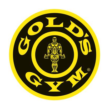
This logo, just like the FBI logo, works because of it's bold design. The yellow strands out against the black, the font is bold, block-like and easy to read and it's different to the others gym logos as it's in a circle instead of a square or rectangle. The stereotypical iron/muscle-man in the centre would attract people to the gym as their goal is to get fit and to achieve a better looking body and the logo illustrates that it can happen.


Space Truckin'

Monday, February 22, 2010

Here's the second post we were asked to do - I'm sure it' has to be better than the "Fruity" one.
It was a bit of a challenge because of the diverse range of objects and the shapes you had to work around with the pen tool. Placing the objects to make the image look good was also difficult, but despite it being frustrating at times, it was a great exercise.

Here's the first composit we were asked to do and this is my attempt. It was the first time I'd used the pen tool and I despised it to begin with but after a while I sort of got the hang of it. In this exercise we also learned about using the drop shadow effect and using gradients. The edges on the fruit are a bit dodgy but hey.

Photographers & Their Art

Wednesday, February 17, 2010

ARAKI NOBUYOSHI
This photograph has a peaceful, serene feel to it and the fact that the subject (Araki's wife) isn't in the centre of the photograph, she is still the focus. I prefer photographs where the subject isn't in the middle because it gives the image a more natural, spontaneous feel.


MARTIN PARR
This photograph his colourful and the eye is instantly drawn to the fluorescent colours and patterns on the hat. I like this photo because at first it is misleading - the hat would suggest that a younger child is the subject, but then you see the floral dress and the characteristc wrinkled hands which tells you the subject is, in fact, an elderly person.


ROBERT ADAMS
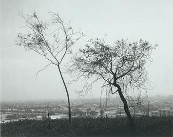
I instantly was drawn to this photo because of the dark silhouettes of the trees against the light sky. I like this because the image goes from highly contrasted at the top (the trees against the sky) and then here's the city below which has greys with less contrast and the fog blends it in. Then you have the grass which is almost completely dark, contrasting with the completely light sky.


JEFF WALL
This photograph has a spontaneous feel to it and the composition is interesting; pleasing to the eye. The paper almost resembles leaves flying from the tree branches, and directs the eye across so you can notice the people, the telegraph poles and cityscape in the background.


GREGORY CREWDSON
The colours in this photograph, especially the houses, are what I lik best about this photograph. It really does look like a still frame from a scene of a movie! The way the light reflects off the wet road creates the effect of the calmness after the rain has passed. This photograph is my favourite out of all the ones I have collected.


CINDY SHERMAN
The facial expression of the woman in this photo is the first thing you notice - you can imagine what she's just read in the letter she has in her hands. Again, the subject isn't in the centre, but the photograph is balanced because of the dark brick wall and the back of a chair on the other side.


TONY VACCARO
The lighting and contrast in this photograph is amazing. The stripes of light gives you the feeling of a prison or being behind bars, being trapped, and the expression on the subject's face enhances that feeling. The light hasnt fallen on the large bags under his eyes, making them dark, which makes the subject look tired and gloomy, yet the lighting makes you have a weary feeling about him.


RICHARD BILLINGHAM
This photograph has a dull, depressing feeling which is enhanced by the lack of bright light and colourful settings. Even though the wallpaper in the background is patterned wih orange and yellow, it is still dull. You can't see the subject's (Billingham's father) face, he's turned away, giving the sense that he doesn't want to be seen, that he doesn't have the heart to look or to face the world, which is enhanced by his slouched posture. The fact that he's (the father) an alcoholic is made clear in this shot as there's a bottle close to his hand in the shot.


LARRY CLARK - JACK AND LYNN JOHNSON, OKLAHOMA CITY (from "Teenage Lust")

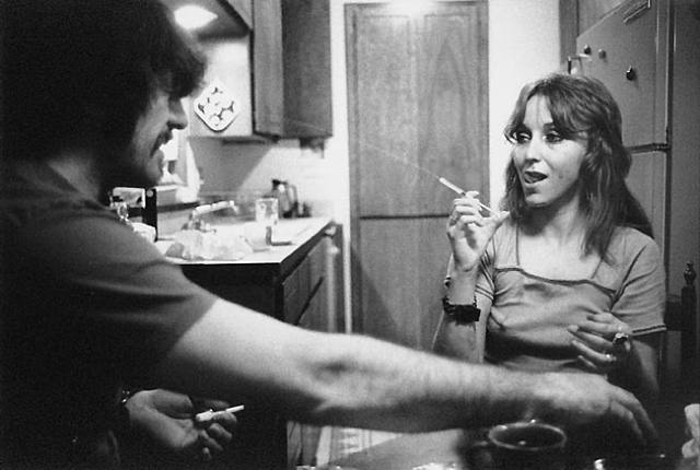
I like this photo by Clark because of it's realistic nature - it doesn't look staged. Even without nudity and suggestive positioning it is provocative (Lynn's facial expression with the needle in her hand creates this feel).