About my logo and collection of products:

For this assessment, I chose to do debt collectors. I chose this business for a few reasons:

I thought it would be a challenge to create something that was serious, clean and clinical, but also something that was creative and unique. I also had never actually seen what a debt collector’s logo or what other items such as brochures looked like so I wanted to explore this because it would be new to me.

When I started doing some research, it was difficult to find businesses on the net that had a logo on their website - most of them had the name of their company in a nice, mostly serif, typeface on the banner - so there wasn't much to go on. So instead of choosing something else I researched some lawyer’s logos, which gave me a good idea as to what my logo should look like. Most of them had cool, low key colours, usually with a nice image with it. One in particular, Addison's Lawyers, used a dark blue with a white detailed swirl so I thought I would attempt to do something like that.

My first attempt at a logo had this swirl and circle pattern and the colours were dark purple and grey and to be honest, it was bad and I wasn't impressed with my effort - it looked like it belonged to something like a classy clothing boutique - so I then decided to make up some colour palettes to draw inspiration from. Black and grey were two of the colours I chose to use because they were both low key and always work quite well together. Green, red and blue were the three other colour choices I had to go with the black and grey.

Before I gave the debt collection company a name, I started work on the new logo. I still wanted something that had flow, that wasn't straight up-and-down, something that wasn't too curly or too playful, so I decided to look at some display typefaces I had to see if I could get anything from there. The one I decided to look more closely at was called Parchment (a little bit horrendous), where all the letters were done in this style that looked like an abstract form of Old English - you couldn't really tell half the time what the letters were supposed to be. My logo ended up coming from a section in the letter M. One side had two wave/curls which were uneven and spaced apart so I fixed that and brought them together. I sharpened a few of the edges as well so they weren't so rounded.

Here is the character I used:


Next I added the circle to add another shape and more interest to the logo - whilst it looked interesting enough on its own; I believed it needed some colour and something to soften it so it wasn't just a solid black shape.

When I looked at the finished design for the logo, I was a little worried that it looked too oriental, but it was still interesting and I'm sure I got the unique look I was going after for the logo - it worked as well as a serious but creative logo. Once the logo was completed I named the company "Murrumbidgee Debt Recovery Agency" and chose to use the typeface Cambria - a simple serif that has elegance about it without being at all fancy for busy.


Next came working on the other products. I designed the letterhead first because it was going to have all the contact details on it that I could use for the other products. I didn't want to just have the logo and information on these products (most of the letterheads I looked at had some colour down the bottom, usually a slope or block), so I decided on a theme pattern that I could use on everything and it would still look good on a different size and shape. The theme I came up with was a coloured slope - it started at the bottom left corner and came up to a slope which ended on the right hand side. I achieved this by making a vector rectangle that sat at the bottom of the page and then had a vector oval which was the same colour as the page that I put over the top to get an even edge and the slope I wanted. After I looked at it for a while I decided to add a black border to the slope - it looked too flat with just the one colour and I wanted to tie it in with the logo at the top of the page. I copied the vector oval and made it black and placed it underneath the other oval, bringing it down slightly so it was visible. I also rotated it to get a different width running along the border. I copied this to all of my product bases and added the logo and additional information afterwards. I did these all in blue, green and red versions, but finally decided on the blue because I believed it looked the nicest with the light grey and black and it made it look more serious that the green and red - the red made it look too oriental anyway. Afterwards, I added a very transparent logo in the background of the bookmarks and business card after deciding that these pieces in particular needed something else.


The critique:


On Monday May 17th I had my collection critiqued and I was nervous about getting up in front of anybody and presenting it, but I was proud of what I'd come up with. I was really pleased with the outcome in the end: over all, everyone liked my work which made me feel really confident and even happier about my work. However there were quite a few improvements I had to make:


-I had to adjust the alignment on some of my products. On some of them, such as the business card, I had to make sure the distance from the edge to the logo was the same from the edge to my block of text/information. This had to be done on my business card and my brochure. The pages on my brochure had to be swapped because it isn't the same principle for the inside pages as it is for the outside - instead of making it 3, 2 like you would on the cover (4, 1) you make it 2, 3.


-I had to make the bookmark a lot thinner - it was too fat and probably would have taken up half of the book.


-I had to make the coloured curves on the bottom of my products a lot more shallow. It was pointed out that it looked like a bit of a skateboard ramp, and i was inclined to agree - I got a little too over excited and made them a little bit too steep, and it was especially evident on my with compliments slip and letterhead.


-Fix the transparency of the logo on the business card and the bookmarks. On my laptop they looked the same, but I had forgotten the percentage I had set the opacity at on the business card and guessed for my logo without checking back. Lo and behold, when I looked back and checked on the original documents, one item was at 5% and the other was at 10%.


It was also suggested by some of the members of the class that I should try and simplify my logo, such as having one wave/curl down the side instead of the two or try and make it into an M so it looked as though it was related to the company name. There was also a lot of joking about my logo looking like it was for ninjas and that one would jump out at you to take your money if you didn't pay it. The blue dot was also said to look like an eye - it was the daunting thing about my logo; you saw the blue spot and you knew exactly what it was - it was watching you. Possibly the best part of the critique.


The critique was a great experience and I enjoyed it a lot. I gained a lot from hearing the positive feedback from everyone.


The changes to my products were easy ones to make. I made my curves shallower by rotating the vector ovals and placing them down further on the page. The alignment adjustments were just a matter of following the rulers more carefully, and I just had to bring the opacity down on one of the products. I did have to build the bookmark from scratch again but that wasn't difficult. I also had to remake my brochure and reorder the pages, but it was definitely worth it because now it looks ten times better than it did. I also changed the text on the brochure so the boxes of text looked better on the spread out page.


Simplifying the logo was the difficult part. I tried reducing the wave/curls to one, but I had to resize it and it looked really bad because it was a lot wider than the stroke on the opposite side and making it a lot thinner made it look cheap and nasty. Making it look like an M made it look honestly ugly and more complicated than before. I did just have the two wave/curls and the blue spot rotated so it was a long logo, but it just wasn't the same, so I decided to leave the logo as it was - I'm confident it works and I don't think it can really be changed.


I am now really happy with my products and I'm looking forward to doing more of these in the future.


Logo Assessment - Debt Collectors/Debt Recovery

Thursday, May 13, 2010


Childhood Toy - Rocking Horse

Tuesday, May 11, 2010

Night - Front Door Step

(extra) Close Up - I See You

Urban - "Classy Graffiti"

Black and White - Fireplace

High Depth of Field - Moving Forward

Portrait - Blending In

Low Depth of Field - Wild

(extra) High Angle - Top of the World

(extra) Portrait - Iron

(extra) Berries

More Logos

Thursday, May 6, 2010


Type Experiment

Monday, May 3, 2010

Typographic Art

Thursday, April 29, 2010

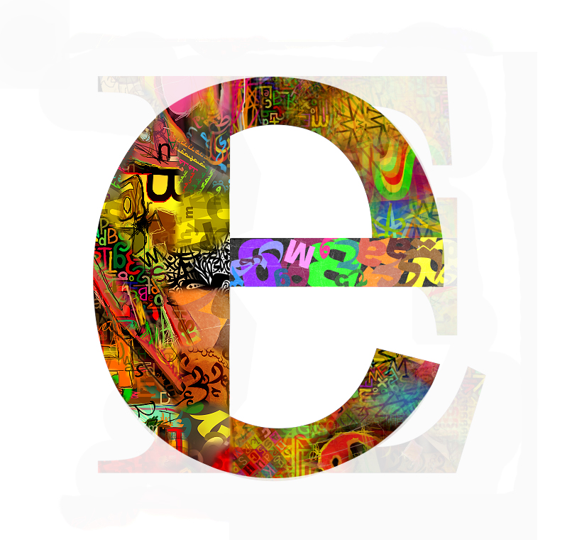
by al2sami on deviantArt. E from series A-Z. It's vibrant, eyecatching and colourful and the capital E in the background adds an interesting element - a good alternative to having just a plain white background.


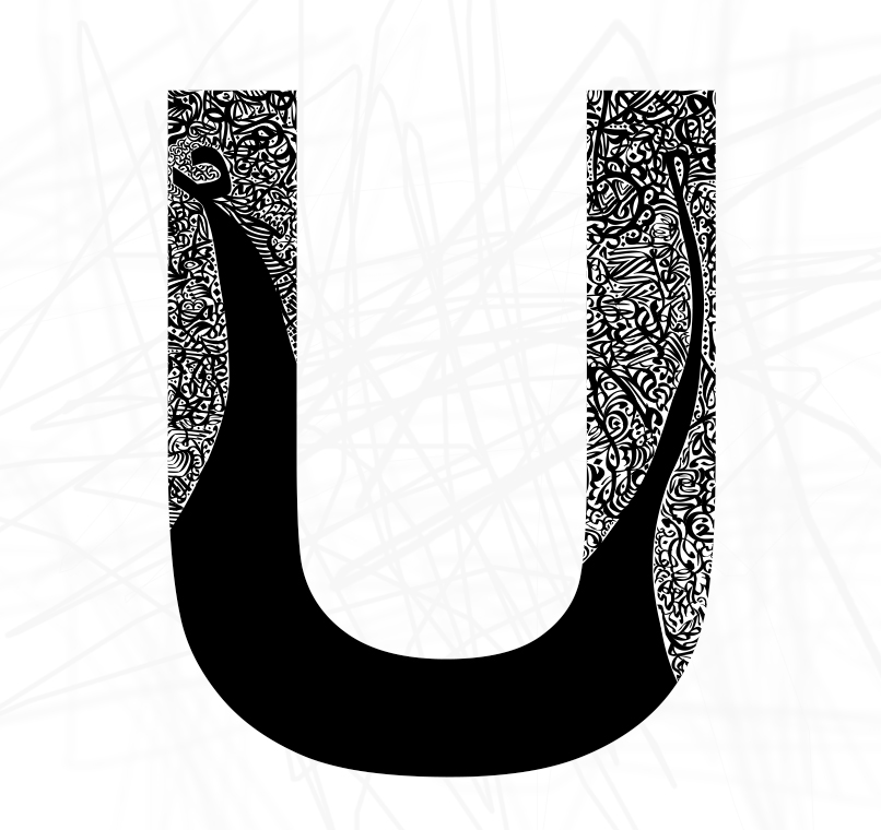
by al2sami on deviantArt. U from series A-Z. The black and white is simple, along with the character, and the patterns are intricate.


by fuzzyzebra on deviantArt. This is just amazing. This may be strange but it has a really scientific feel about it. It's not just flat, it looks like you could reach out and touch it. Typography taken to a whole other level.

by vladstudio on deviantArt. The font used in this isn't particularly good, but I thought the idea was really awesome! I liked how they shaped the type and there's contrast between large and small sizes throughout the image.

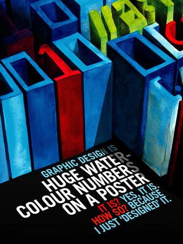
by gravitymachine on flikr. The characters used in this poster aren't just ordinary characters because of the way the designer has made them look more like a painting by using texture and the lines of the characters aren't perfectly straight - they're more fun. The type at the bottom is placed well and the choice of type isn't fancy so it doesn't take away from the watercolour characters. The use of different colours also works because the red and the blue match with the red and the blue on the watercolour characters.


by palax on deviantArt. I really like this piece for several reasons. It uses Helvetica, which is one of my favourite typefaces because of it's simplicity and sophistication. The combination of red, blue and beige/sepia/brown works well together with the black and white and I also really like the grunge texture used. The diagonal layout is also interesting.

Modern Kraft Graphic Design Conference Poster

Tuesday, April 20, 2010
Modern Kraft
Graphic Design Conference
May 24-28 2010
Sydney Convention & Exhibition Centre, Darling Harbour

Coming up with a design for this was both difficult and not at the same time. Researching other graphics posters were good for inspiration but the challenging part was making it appropriate. I wanted something that didn't look corperate, something that was bold and fun. The idea for the type came from a poster I found on dA where the abbreviation for the exhibition was the main focus of the poster. It went in a backwards 'J' shape coming from the top of the page, curving off to the side and I thought the idea was great so I incorporated it into my own work. The layout of the poster was probably the easiest part for me , even though I had to change it around a bit to match with the typeface I'd picked for the main focus. Choosing such a typeface was also difficult because of the lack of choices on Illustrator (I guess I'm a bit picky when it comes to fonts), but with some rearranging I came up with a solution.

I made three colour versions of the poster. I decided that simple but bright colour schemes are more effective overall instead of having five or so colours. I like the blue and orange best.


I took the first version of the poster for revision - the printed version turned out red and blue instead of the orange and aqua-coloured blue and I forgot to save with the white (oops) so it didn't look as good as I pictured. Looking at the revised versions now I think the white was off in the first place.

In the revision I was told the text should maybe be a brighter colour so it stands out more, like white, so this is what I came up with.

Characters

Sunday, April 18, 2010
I was really stuck with this task - I had no idea what to do. I originally had birds but then I wanted to do something else a bit more fun. So I thought I would do friendly monsters. I call them Cyclods. :D


FERGUS


:)

Friday, April 16, 2010


Isn't this awesomely cool? I'd really like a table like this. It's got a really funky feel to it and the red really stands out against the white.

http://joenh.deviantart.com/art/Cassette-Table-55143169

Art Exhibitions and Wild Pears

Thursday, April 1, 2010
I guess you could call these my first freelance jobs - only, I didn't get paid; I did them for community service. The first is the logo I created for the Up-2-Date Art Exhibition 2010. The theme for this year's show is "Boots, Bags, Buttons and Bows." For those of you who haven't heard of the exhibition before, it's held at the Up-2-Date store in Coolamon which was listed as a heritage building because it has one of the only cash-carry systems still in tact and still working. The art show has been running for a few years now and we usually have an artist in residence who's works feature in the show and they are able to talk to the public about their works and they run workshops for the community to develop a certain art style. Each year, the show has a theme in which artists can submit works based upon, and they are exhibited in a separate room. Artworks are judged and the best from each category - oils, acrylics, drawings, etc, - receives a prize and then there's an overall judge's/people's choice award. The first design I originally did was a digitalised version of a sketch my aunty did. It was a paper bag with buttons coming out of the top and bow at the front with boots on the bottom. We revised the idea and decided to have a label on the bag which had a boot on it as a watermark and decided instead of a ribbon bow, we'd have a rafia bow (which is a bow made out of strands of yarn/paper) which went better with the paper bag (I actually ended up deleting it so unfortunately I don't have the image to show you the comparison). It turned out well, but the committee wanted something different so they gave me a basic picture of what they wanted so I created it from their idea - something more stylised and sophisticated. I wasn't impressed to begin with, seeing as the first design took quite some time to finish, but when we looked at them both again, we decided that the second design was much better.

The second is the flyer/promotional poster for The Wild Pear's fashion show. I decided on a Moulin Rouge-ish theme for the poster (kind of like Art Nouveau) and personified the pears as models. I admit it's a little rough but the ladies liked it so I'm glad. Both designs were done in Corel Painshop Pro X - I wish I had had Illustrator so the lines and things weren't so wonky. But I'm still happy with the outcome as a whole.